
ButtonGroup
'%3e%3cpath%20d='M19%2028.5C19%2025.9804%2020.0009%2023.5641%2021.7825%2021.7825C23.5641%2020.0009%2025.9804%2019%2028.5%2019C31.0196%2019%2033.4359%2020.0009%2035.2175%2021.7825C36.9991%2023.5641%2038%2025.9804%2038%2028.5C38%2031.0196%2036.9991%2033.4359%2035.2175%2035.2175C33.4359%2036.9991%2031.0196%2038%2028.5%2038C25.9804%2038%2023.5641%2036.9991%2021.7825%2035.2175C20.0009%2033.4359%2019%2031.0196%2019%2028.5Z'%20fill='%231ABCFE'/%3e%3cpath%20d='M0%2047.5C0%2044.9804%201.00089%2042.5641%202.78249%2040.7825C4.56408%2039.0009%206.98044%2038%209.5%2038H19V47.5C19%2050.0196%2017.9991%2052.4359%2016.2175%2054.2175C14.4359%2055.9991%2012.0196%2057%209.5%2057C6.98044%2057%204.56408%2055.9991%202.78249%2054.2175C1.00089%2052.4359%200%2050.0196%200%2047.5H0Z'%20fill='%230ACF83'/%3e%3cpath%20d='M19%200V19H28.5C31.0196%2019%2033.4359%2017.9991%2035.2175%2016.2175C36.9991%2014.4359%2038%2012.0196%2038%209.5C38%206.98044%2036.9991%204.56408%2035.2175%202.78249C33.4359%201.00089%2031.0196%200%2028.5%200L19%200Z'%20fill='%23FF7262'/%3e%3cpath%20d='M0%209.5C0%2012.0196%201.00089%2014.4359%202.78249%2016.2175C4.56408%2017.9991%206.98044%2019%209.5%2019H19V0H9.5C6.98044%200%204.56408%201.00089%202.78249%202.78249C1.00089%204.56408%200%206.98044%200%209.5H0Z'%20fill='%23F24E1E'/%3e%3cpath%20d='M0%2028.5C0%2031.0196%201.00089%2033.4359%202.78249%2035.2175C4.56408%2036.9991%206.98044%2038%209.5%2038H19V19H9.5C6.98044%2019%204.56408%2020.0009%202.78249%2021.7825C1.00089%2023.5641%200%2025.9804%200%2028.5H0Z'%20fill='%23A259FF'/%3e%3c/g%3e%3cdefs%3e%3cclipPath%20id='clip0_1_137'%3e%3crect%20width='38'%20height='57'%20fill='white'/%3e%3c/clipPath%3e%3c/defs%3e%3c/svg%3e)


The ButtonGroup component renders a group of related buttons next to each other.
Anatomy
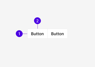
| # | Required | Element | Description |
|---|---|---|---|
| 1 | Group | Wraps two or more Buttons and decides whether they connect or separate. When separated, applies gap spacing between the Buttons. | |
| 2 | Button | A single action in the group. |
Guidelines
When to use
ButtonGroups wrap two or more Buttons together to treat them as a unified set of related actions. Grouping also allows the Buttons to inherit props for variant, size, and disabled state. Buttons may either be connected (segmented) or spaced.
ButtonGroup vs. Tabs
ButtonGroups and Tabs both use an inline set of buttons to perform a task. Be sure to understand the difference between them as they are not interchangeable:
- ButtonGroups display a set of closely-related actions together, either segmented or separated.
- Tabs are lists of buttons used to group content under different panels to make information easier to understand.
Segmented vs. spaced
Buttons may be rendered as a segmented, "single" group or separated with gap spacing. Use the segmented variant when the actions are closely-related within a single context, such as zoom controls, as a WYSIWYG editing toolbar, forward and back buttons, etc. Use the spaced variant for form submission and cancellation or actions within a modal's footer.
Best practices
Consistency
Consistency matters. Avoid mixing sizes or variants on individual Buttons to maintain a clean interface.
Group size
Limit group size to four Buttons maximum. A larger group is more difficult to scan as the Buttons take up more space on the page. Consider placing extra actions into a contextual DropdownMenu, or pairing the main action with one in a split button.
Toolbars with Icon-only Buttons may include more visible Buttons before the rest are placed within a DropdownMenu.
Importance
Primary Buttons serve the purpose of highlighting the most important action a user may take on the current page. When placing Buttons in forms or where users are expected to complete a task, be mindful to set each action at the most appropriate importance level. Actions are displayed from most to least important starting from right to left.
Avoid placing more than one Primary Button within a workflow or page.
Configurations
When using ButtonGroups, consider the following common configurations before creating a new design standard.
A segmented group of Icon-only Buttons acts as a compact toolbar for actions on a canvas or preview. Provide each Button an accessible label as there's no visible text.
Paired actions are the most common configuration, providing the user a way to accept or reject changes being made in the given context.
Pagination displays as a segmented collection of items used to help users navigate through sets of data in the form of pages.
Split buttons are used to display one main action with other contextual actions relegated to an adjacent DropdownMenu.
Appearance
Variants
Buttons connect into a single, segmented control with overlapping borders.
Buttons maintain their default styling and have space-100 between them.
Icons
Icon-only ButtonGroups are used for toolbars. Use icons consistently—if one Button has an icon, they must all have icons.
Icons paired with labels are best suited for communicating actions that will take place.
Visible labels may be omitted for commonly-used icons.
Provide a label with less-common icons or to better communicate the action taking place.
Sizes
ButtonGroups come in two sizes: medium and small. Setting the size on the group overrides the size prop set on the individual Button to maintain consistency.
Medium is the default size used in the majority of cases.
Small groups are used for smaller screen sizes and less prominent actions on the page.
Behaviors
States
The base Button uses the default variant colors when no user interaction is detected.
On mouse hover, Button styles update to hover colors.
Focused Buttons receive the standard 2px light blue outline.
On user activation, Button styles update on user activation.
Disabled Buttons cannot be interacted with. Lighter colors are used for all variants.
Shared configuration
Buttons within the group inherit the variant, size, and disabled state through component props. Each prop functions slightly differently:
- Variant allows Buttons with their own defined variant prop to maintain it. Buttons with no set variant will adopt the group's setting.
- Size set by the group always overrides the individual Button's setting. This is important for maintaining a consistent visual hierarchy.
- Disabled state is applied to all Buttons when set by the group. However, a single Button's disabled state will remain disabled even when the group as a whole is enabled.
Buttons adhere to the group's settings.
Individual Buttons may opt out of the variant set by the group.
Content
Button labels are written consistently across the application. For more information on writing labels, see the Content section on the Button page.