
'%3e%3cpath%20d='M19%2028.5C19%2025.9804%2020.0009%2023.5641%2021.7825%2021.7825C23.5641%2020.0009%2025.9804%2019%2028.5%2019C31.0196%2019%2033.4359%2020.0009%2035.2175%2021.7825C36.9991%2023.5641%2038%2025.9804%2038%2028.5C38%2031.0196%2036.9991%2033.4359%2035.2175%2035.2175C33.4359%2036.9991%2031.0196%2038%2028.5%2038C25.9804%2038%2023.5641%2036.9991%2021.7825%2035.2175C20.0009%2033.4359%2019%2031.0196%2019%2028.5Z'%20fill='%231ABCFE'/%3e%3cpath%20d='M0%2047.5C0%2044.9804%201.00089%2042.5641%202.78249%2040.7825C4.56408%2039.0009%206.98044%2038%209.5%2038H19V47.5C19%2050.0196%2017.9991%2052.4359%2016.2175%2054.2175C14.4359%2055.9991%2012.0196%2057%209.5%2057C6.98044%2057%204.56408%2055.9991%202.78249%2054.2175C1.00089%2052.4359%200%2050.0196%200%2047.5H0Z'%20fill='%230ACF83'/%3e%3cpath%20d='M19%200V19H28.5C31.0196%2019%2033.4359%2017.9991%2035.2175%2016.2175C36.9991%2014.4359%2038%2012.0196%2038%209.5C38%206.98044%2036.9991%204.56408%2035.2175%202.78249C33.4359%201.00089%2031.0196%200%2028.5%200L19%200Z'%20fill='%23FF7262'/%3e%3cpath%20d='M0%209.5C0%2012.0196%201.00089%2014.4359%202.78249%2016.2175C4.56408%2017.9991%206.98044%2019%209.5%2019H19V0H9.5C6.98044%200%204.56408%201.00089%202.78249%202.78249C1.00089%204.56408%200%206.98044%200%209.5H0Z'%20fill='%23F24E1E'/%3e%3cpath%20d='M0%2028.5C0%2031.0196%201.00089%2033.4359%202.78249%2035.2175C4.56408%2036.9991%206.98044%2038%209.5%2038H19V19H9.5C6.98044%2019%204.56408%2020.0009%202.78249%2021.7825C1.00089%2023.5641%200%2025.9804%200%2028.5H0Z'%20fill='%23A259FF'/%3e%3c/g%3e%3cdefs%3e%3cclipPath%20id='clip0_1_137'%3e%3crect%20width='38'%20height='57'%20fill='white'/%3e%3c/clipPath%3e%3c/defs%3e%3c/svg%3e)


- Recipients
- Content
- Review
Page is the outermost layout for a route, setting where the title and page-level actions sit and how wide the content column is.
Anatomy
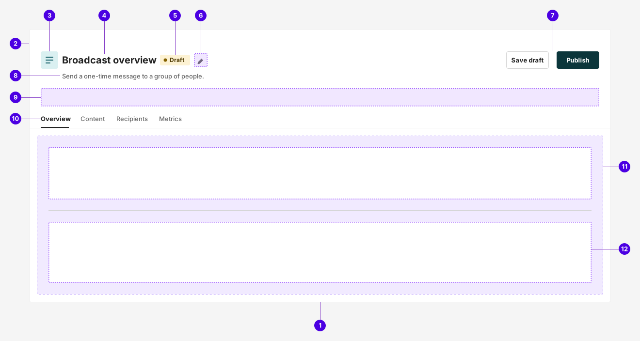
| # | Required | Element | Description |
|---|---|---|---|
| 1 | Container | Centers the header and the body in a shared width band, and sets the content width that the body and every section inherit. | |
| 2 | Header | Spans the top of the page and carries its identity and page-level actions. | |
| 3 | Icon tile | A colored tile standing for the kind of thing the page is about. One of ten colors. | |
| 4 | Title | Names the specific thing the page is about. Truncates rather than wrapping, so the actions are never pushed off the header. | |
| 5 | Status label | Reports the state of the thing the page is about, such as a draft or a paused campaign. | |
| 6 | Title action | A single inline action that operates on the title itself, most often renaming. | |
| 7 | Actions | Page-level actions, grouped at the trailing edge of the header. | |
| 8 | Description | One line under the title explaining what the page is for. Wraps freely, growing the header rather than the title row. | |
| 9 | Extra | A band for page-level content the header has no dedicated slot for, most often a banner about the page as a whole. Stays inside the content band, so it lines up with the title above it and the body below. | |
| 10 | Tabs | Navigation between sibling views of the same subject. Sits on the lower edge of the header so the tabs read as part of it rather than as body content. | |
| 11 | Body | Holds the page content, inset from the page edges and constrained to a content width. | |
| 12 | Section | A band inside the body with its own content width and an optional divider on the boundary below it. |
Guidelines
Page is the outermost layout for a route. It settles three things every screen in the product shares: where the title and the page-level actions sit, how wide the content column is, and how content stacks down the page. Reaching for it is what keeps two unrelated screens feeling like one application.
When to use
Use a Page for anything that occupies a whole route. In practice that covers nearly every screen:
- Detail views. A single campaign, segment, or person, usually with a status label beside the title and tabs for its sibling views.
- Index views. A list or table of things, with the action that creates a new one in the header.
- Settings and forms. A narrow reading column, often holding a stack of Panels.
- Flows. Wizards and setup flows, where the body is a stack of sections rather than one block of content. See the Wizard layout pattern.
- Builders. Canvas and composer surfaces that take the whole viewport.
Do not use a Page for something rendered inside another page. A Page owns the page title and the content width, so nesting one inside another produces two competing titles and two competing width bands.
Page vs. Panel and Modal
Page, Panel, and Modal all frame content, but they sit at different levels of the layout and are not interchangeable:
- Page is the route surface. It owns the page title, the page-level actions, and the width of the content column.
- Panel is a bordered container inside a page body that groups related content or fields. A body usually holds several.
- Modal overlays the page for a single focused task the user should finish without leaving. A task that needs a title, tabs, and its own actions wants a page, not a modal.
Body and sections
A page's content takes one of three shapes. Either the body holds it directly, or the body holds a stack of sections and each section holds a band of it, or a rail stands beside that stack.
Reach for sections when the width changes down the page. A wizard is the clearest case: the progress indicator wants the full width, the step's form wants a narrow reading column, and the actions want to line up with the form.
When you use sections, leave the body unconstrained and put the width on each section. A section can never be wider than the body containing it, so constraining the body caps every section with it. Sections also carry no padding of their own, because the body has already inset the page.
Reach for a rail when something belongs beside the content rather than above it — a wizard's progress indicator turned on its side, a table of contents, a summary. It stands beside the whole stack of sections, so it can stay in view while they scroll. Widths work the other way around here: set the content width once for the page, since the rail positions itself against the content column.
Best practices
Actions
The header actions hold the actions that operate on the whole thing the page is about. Keep it to two, or three at the outside. Beyond that, no button reads as the primary one.
Actions that operate on one row, one field, or one Panel belong beside that thing rather than in the header. Overflow actions belong in a menu behind a single trigger.
Welcome series
Campaign content
Do: Keep the header to the page's own actions, with one clear primary.
Welcome series
Campaign content
Don't: Crowd the header with every action available on the page.
Header density
Every slot in the header is optional, and filling all of them is rarely right. Each one earns its place by answering a question the title cannot: the icon tile says what kind of thing this is, the status label says what state it is in, the description says what the page is for, the extra band says what is true of the page right now, the tabs say where else the user can go.
Across the product the slots that pull their weight most often are the description and the actions, then tabs on pages with sibling views. An index page usually needs a title and one action. A settings page usually needs a description. A detail page usually needs a status label and tabs. Adding the rest makes the header taller without making it clearer.
Segments
A table of segments
Do: Fill only the slots the page needs.
Segments
Active
A list of the segments in this workspace.
A table of segments
Don't: Fill every slot regardless of whether the page needs it.
Loading
Load the body rather than the whole page whenever the header is already known. On a page with tabs, or a page whose header is full bleed, the header is what tells the user where they are, so replacing it with a spinner throws that anchor away and makes the page look as though it navigated somewhere else and back.
Load the whole page only when the header itself depends on the data being fetched, which is the case on a detail page whose title is the name of the record.
Reach for the body's own loading state rather than dropping a loader into the body yourself. Only the built-in state centers the loader in the space the content is about to occupy, so the page does not jump when the content arrives.
Segments

Loading…
Do: Keep a known header in place and load only the body.
Loading…
Don't: Replace a header the user is navigating within.
Section dividers
A divider belongs on a boundary that marks a change of region, not on every boundary. The gap between two sections already separates them, and a rule in every gap turns a page into a ledger.
Put a divider on the section before the boundary you want drawn. Dividers never render after the last section, so a page cannot end on a stray line.
Create broadcast
Step content
Do: Draw a divider only where the page changes region.
Create broadcast
- Recipients
- Content
- Review
Step content
Don't: Rule every boundary on the page.
Configurations
Page has no modes. What it has is a handful of arrangements that recur across the product, each a different combination of header slots and body width. Start from the closest of these rather than composing a new one, so screens doing the same job look like they do the same job.
Segments
A table of segments
Index
A list or table of things. The title is the plural noun, and the only header action is the one that creates a new item.
Welcome series
Draft
Campaign content
Detail
A single record. The title is the record's name, a status label reports its state, and tabs move between its sibling views.
Workspace settings
Control who receives messages from this workspace.
Settings
Configuration for a whole workspace or account. A description explains the scope, and a narrow body keeps the fields at a readable measure.
Create broadcast
- Recipients
- Content
- Review
Step content
Wizard
An ordered flow. The body is a stack of sections so the progress indicator can span the page while the step's form stays narrow.
Welcome series
A canvas that uses the whole viewport
Builder
A canvas or composer. The header stays minimal and the body takes the whole viewport, because the work happens on the canvas rather than in a reading column.
Appearance
Content width
Three presets set how wide the content column is. Set one on the page and the body and every section inherit it, so a header assembled in one file and a body assembled in another still line up. Set one on an individual body or section to override the page default for that band alone.
- Standard is the default and suits most pages: wide enough for a table, capped so lines of text never run the full width of a large display.
- Narrow suits forms, settings, and anything read top to bottom. Its measure is roughly one column of comfortable prose.
- Full removes the constraint entirely. Use it for canvases and builders, or to break a single band out of a narrower page default.
Segments
A table of segments
Standard
The default width. Suits index pages, detail pages, and anything holding a table.
Workspace settings
Narrow
A single reading column. Suits forms, settings, and wizard steps.
Welcome series
A canvas that uses the whole viewport
Full
No constraint at all. Suits canvases and builders, or one band that has to break out of a narrower page.
Full screen
A full-screen page runs its header edge to edge on a raised surface, with a rule separating it from the body. The body still takes whatever content width the page sets, so the header spans the viewport while the content stays in its column. The effect is a fixed frame around content that changes, which is what makes it the right shape for a page the user navigates within: a detail page with tabs, a wizard, a builder.
A page that is not full screen keeps the header inside the same width band as the body, with no raised surface behind it. The header then scrolls and shifts with the content rather than framing it. Most of the product is still built this way, and it is a reasonable choice for a simple page the user reads once and leaves. Prefer full screen for anything with tabs or sections, where the header has to hold still while the content underneath it changes.
When a full-screen header has tabs, the rule under the header is dropped, because the tab strip already draws that line.
Segments
A table of segments
Full screen
The header spans the viewport on a raised surface, framing the content below it.
Segments
A table of segments
Standard
The header sits in the same width band as the body, with no surface behind it.
Icon tile
The icon tile stands for the kind of thing the page is about, not the specific one. Pick the icon for the record type and keep the same icon and color on every page of that type, so the tile becomes a recognizable mark rather than decoration. Ten colors are available, and teal is the default.
Leave the tile off a page whose subject needs no explaining. An index page titled "Segments" gains nothing from one.
Welcome series
Campaign content
Default
Teal is the default, and is the right choice unless a record type already owns a color elsewhere in the product.
Colors
Use a color to tell apart record types that appear side by side, and apply it consistently to every page of that type.
Status label
The status label reports the state of the page's subject. It sits immediately after the title, inside the title's own row, so it reads as part of the name rather than as a separate piece of content.
Use the status dot for states in a lifecycle the user moves things through, where the color carries meaning: green for running, yellow for draft, grey for archived. Leave the dot off a label that classifies rather than reports progress.
Welcome series
Draft
Campaign content
Welcome series
Running
Campaign content
Welcome series
Archived
Campaign content
Lifecycle states
A dot plus a color reads as a position in a lifecycle, so use it for states a record moves between.
Behaviors
States
Page has no resting interactive states of its own. It is a layout container, so hover, focus, and pressed states belong to the controls inside it. The one state the page itself takes is loading.
Segments
A table of segments
Base
The page renders its header and body as composed.
Segments
Loading…
Body loading
The header stays in place and the body is replaced by the page loader. Use this whenever the header is already known.
Loading…
Page loading
The whole page is replaced by the page loader. Reserve it for pages whose header depends on the data being fetched.
Dividers
Two divider widths are available, and they differ in what the line spans rather than in how it looks.
A contained divider spans the section's own content column, so the line begins and ends where the content does. Use it when the sections either side share a width and the line reads as a break within one column of content.
An extended divider spans the whole body. Use it when the sections either side differ in width, where a contained line would start and stop at an arbitrary point, or when the boundary marks a change of page region rather than a break in content.
Either width clears the content by one section gap above and below, so the line sits centered in the boundary whichever you choose. A divided boundary is therefore taller than an undivided one, which is correct: a line needs room to read as a separator rather than as an underline.
Workspace settings
Profile details
Notification preferences
Contained
The line spans the section's content column. Use it between sections that share a width.
Create broadcast
- Recipients
- Content
- Review
Step content
Extended
The line spans the body. Use it where the sections differ in width, or where the boundary marks a change of region.
Scrolling
The page scrolls as one. The header is not sticky, so a long body carries the header up out of view with it. Anything that has to stay reachable while the user scrolls, such as the actions that submit a long form, belongs at the end of the body rather than in the header. This is why a wizard's actions are its last section: they scroll with the step's content and stay inside the reading column.
A page always fills at least the height of its container, so a short body still leaves the page looking like a page rather than a fragment floating at the top of the viewport.
A rail is the one part of the body that can be exempt from this. A sticky rail holds its place while the sections beside it scroll, so a wizard's steps stay visible through a long step. Keep it short enough to fit the viewport — a taller rail puts its own lower end out of reach while stuck.
Truncation
The title truncates with an ellipsis rather than wrapping. The title row has to stay one line high so the icon tile, the status label, and the actions can all sit vertically centered against it, and a wrapping title would break that alignment and move the actions around as the title changed length.
The description does wrap, and grows the header downward when it does. That is the difference between the two: the title holds its line and gives up characters, the description keeps its characters and gives up vertical space.
Content
Page content follows the guidelines in the Pluma Foundations Content section, sentence case included. The guidance below covers the decisions specific to a page header.
Structure
Use the table below for examples of writing effective page content:
| Element | Pattern | Example |
|---|---|---|
| Title, index page | Plural noun | Segments |
| Title, detail page | The record's own name | Welcome series |
| Title, flow | Verb + object | Create broadcast |
| Status label | Single-word state | Draft |
| Description | What the page is for, one sentence. | Control who receives messages from this workspace. |
| Primary action | Verb + object? | Create segment |
Action labels
Start a header action with the verb for what it does, and name the object when the page holds more than one kind of thing. On an index page, "Create segment" beats "Create", because the page also holds rows that things can be created against. On a detail page for one campaign, "Publish" is enough: there is nothing else it could publish.
Keep labels to one to three words, in sentence case, with no ending punctuation. Use the same verb for the same action everywhere in the product.
Segments
A table of segments
Do: Name the object when the page holds more than one kind of thing.
Segments
A table of segments
Don't: Leave the object out where the verb alone is ambiguous.
Descriptions
A description explains what the page is for, in one sentence, to a user who has arrived without context. Write one only where the title genuinely leaves that open. A settings page benefits, because "Workspace settings" says nothing about scope. A detail page rarely does, because the record's name and its status already say what the page is.
Do not restate the title, and do not use the description for instructions. Instructions belong beside the field or the control they apply to.
Workspace settings
Control who receives messages from this workspace.
Settings content
Do: Say what the page is for in one sentence.
Workspace settings
These are the settings for your workspace.
Settings content
Don't: Restate the title in other words.
Status labels
Write a status as the state itself, not as a sentence about it: "Draft", not "This campaign is a draft". One word wherever the vocabulary allows, two at the outside, and always the same word for the same state across the product. A campaign that reads "Running" on its detail page must not read "Active" in the list it came from.
Use the label for a state, never for a category. A category that never changes belongs in the title or the icon tile.
Welcome series
Running
Campaign content
Do: Name the state in one word, matching the vocabulary used elsewhere.
Welcome series
Currently running
Campaign content
Don't: Write the status as a sentence about the record.
Titles
A title names the thing the page is about, in sentence case, with no ending punctuation.
On an index page that is the plural noun for what the page lists, with no qualifiers: "Segments", not "All segments" or "Segment list". On a detail page it is the record's own name, exactly as the user typed it, which means titles will sometimes be long and sometimes be careless, and the header has to hold up either way. On a flow it is the verb and the object: "Create broadcast".
Never put the state, the count, or the record type into the title. The status label carries the state, the body carries the count, and the icon tile carries the type.
Welcome series
Draft
Campaign content
Do: Use the record's own name and let the other slots carry the rest.
Campaign: Welcome series (draft)
Campaign content
Don't: Fold the record type and its state into the title.