
'%3e%3cpath%20d='M19%2028.5C19%2025.9804%2020.0009%2023.5641%2021.7825%2021.7825C23.5641%2020.0009%2025.9804%2019%2028.5%2019C31.0196%2019%2033.4359%2020.0009%2035.2175%2021.7825C36.9991%2023.5641%2038%2025.9804%2038%2028.5C38%2031.0196%2036.9991%2033.4359%2035.2175%2035.2175C33.4359%2036.9991%2031.0196%2038%2028.5%2038C25.9804%2038%2023.5641%2036.9991%2021.7825%2035.2175C20.0009%2033.4359%2019%2031.0196%2019%2028.5Z'%20fill='%231ABCFE'/%3e%3cpath%20d='M0%2047.5C0%2044.9804%201.00089%2042.5641%202.78249%2040.7825C4.56408%2039.0009%206.98044%2038%209.5%2038H19V47.5C19%2050.0196%2017.9991%2052.4359%2016.2175%2054.2175C14.4359%2055.9991%2012.0196%2057%209.5%2057C6.98044%2057%204.56408%2055.9991%202.78249%2054.2175C1.00089%2052.4359%200%2050.0196%200%2047.5H0Z'%20fill='%230ACF83'/%3e%3cpath%20d='M19%200V19H28.5C31.0196%2019%2033.4359%2017.9991%2035.2175%2016.2175C36.9991%2014.4359%2038%2012.0196%2038%209.5C38%206.98044%2036.9991%204.56408%2035.2175%202.78249C33.4359%201.00089%2031.0196%200%2028.5%200L19%200Z'%20fill='%23FF7262'/%3e%3cpath%20d='M0%209.5C0%2012.0196%201.00089%2014.4359%202.78249%2016.2175C4.56408%2017.9991%206.98044%2019%209.5%2019H19V0H9.5C6.98044%200%204.56408%201.00089%202.78249%202.78249C1.00089%204.56408%200%206.98044%200%209.5H0Z'%20fill='%23F24E1E'/%3e%3cpath%20d='M0%2028.5C0%2031.0196%201.00089%2033.4359%202.78249%2035.2175C4.56408%2036.9991%206.98044%2038%209.5%2038H19V19H9.5C6.98044%2019%204.56408%2020.0009%202.78249%2021.7825C1.00089%2023.5641%200%2025.9804%200%2028.5H0Z'%20fill='%23A259FF'/%3e%3c/g%3e%3cdefs%3e%3cclipPath%20id='clip0_1_137'%3e%3crect%20width='38'%20height='57'%20fill='white'/%3e%3c/clipPath%3e%3c/defs%3e%3c/svg%3e)


Anatomy
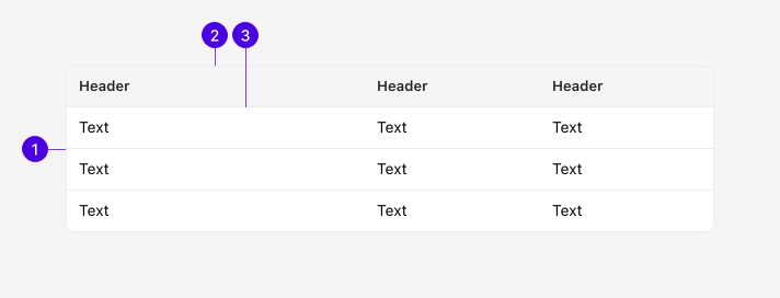
| # | Required | Element | Description |
|---|---|---|---|
| 1 | Container | The root table element. Wraps all rows and cells. | |
| 2 | Column header | Labels each column. Can be made clickable. | |
| 3 | Row | A single data set entry. |
Guidelines
The Table is a component used to display sets of data in an organized, tabular format. Compared to our DataTable component, it's less opinionated and custom, but more than suitable for basic data sets.
Tables for layout
Historically, HTML tables were once used to arrange elements on a webpage before modern CSS layout tools like Flexbox and Grid existed. Never use the Table for layout purposes. We provide components specialized in building layouts such as the Box and Grid. For more information and the full list of available components, see our "Layout" section under "Components."
Table vs. DataTable
The Table and DataTable components are very similar but play a different role in how the user interacts with the data displayed:
- Tables are low-level components used to display data in a read-only basis. For the most basic use cases, a Table is preferred.
- DataTables are feature-rich custom components build on top of the Table. They are suited for more complex interactions such as sorting, filtering, pagination, and column management that the Table component cannot handle.
Appearance
Layout
Layout determines how the Table distributes column widths. The default auto layout allows columns to adjust to content size. Fixed layout divides columns equally regardless of content, providing predictable sizing.
| Product | Category | Price |
|---|---|---|
| Ceramic vase | Home | $45 |
| Leather journal | Office | $28 |
| Cotton blanket | Home | $62 |
Columns adjust to fit their content. This behavior is default and is suitable for most Tables.
| Product | Category | Price |
|---|---|---|
| Ceramic vase | Home | $45 |
| Leather journal | Office | $28 |
| Cotton blanket | Home | $62 |
Columns are divided equally regardless of content size. Use for predictable Table sizing when all columns carry similar amounts of data.
Row styles
Beyond the default bordered rows, the Table supports striped and borderless styles.
Borderless rows remove the separator between entries for a cleaner presentation. Striped rows alternate between two background colors to improve readability in data-dense Tables.
| Product | Category | Price |
|---|---|---|
| Ceramic vase | Home | $45 |
| Leather journal | Office | $28 |
| Cotton blanket | Home | $62 |
Rows have a consistent background with a border separating each entry. Suitable for most use cases.
| Product | Category | Price |
|---|---|---|
| Ceramic vase | Home | $45 |
| Leather journal | Office | $28 |
| Cotton blanket | Home | $62 |
Borders between rows are removed for a cleaner visual presentation. Best suited for smaller datasets.
| Product | Category | Price |
|---|---|---|
| Ceramic vase | Home | $45 |
| Leather journal | Office | $28 |
| Cotton blanket | Home | $62 |
Alternating background colors improve readability for Tables with many rows of similarly structured data.
Behaviors
States
| Product | Category | Price |
|---|---|---|
| Ceramic vase | Home | $45 |
| Leather journal | Office | $28 |
| Cotton blanket | Home | $62 |
The default resting state displays data with bordered rows and a subtle header background.
| Ceramic vase | Home | $45 |
| Leather journal | Office | $28 |
Clickable column headers change background color and text color on hover to indicate they can be activated.
| Product | Category | Price |
|---|---|---|
| Ceramic vase | Home | $45 |
| Leather journal | Office | $28 |
| Cotton blanket | Home | $62 |
When hover highlighting is enabled, rows change background color on mouse hover to indicate interactivity.
| Ceramic vase | Home | $45 |
| Leather journal | Office | $28 |
Focused headers receive the standard 2px light blue outline.
| Ceramic vase | Home | $45 |
| Leather journal | Office | $28 |
The active state highlights a column header in the accent color, typically used to indicate the current sort column.
Depth padding
Table cells support depth-based padding for tree-like or nested table patterns. When enabled on a cell, additional inline-start padding is calculated based on a nesting level, visually indenting child rows to convey hierarchy.
| Category | Items | Revenue |
|---|---|---|
| Electronics | 150 | $45,000 |
| Smartphones | 89 | $32,000 |
| Laptops | 61 | $13,000 |
| Furniture | 203 | $28,500 |
Child rows are indented with padding based on a prop on the first cell and the depth prop on the row.
Panel alignment
When a Table is placed inside a Panel, edge cells (first and last in each row) automatically inherit the Panel's content padding. This ensures that Table content aligns flush with the Panel's borders without manual padding adjustments.
Inventory
| Product | Category | Price |
|---|---|---|
| Ceramic vase | Home | $45 |
| Leather journal | Office | $28 |
| Cotton blanket | Home | $62 |
Edge cells align with the Panel's content area for a cohesive layout.
Content
Caption
Table captions are important for providing assistive technology information about the Table's purpose and the type of data it contains. Short, descriptive nouns or noun phrases work best for captions.
Column headers
Column headers should clearly label the data in each column. Write headers in sentence case and avoid abbreviations where possible.
| Product name | Category | Unit price |
|---|---|---|
| Ceramic vase | Home | $45 |
| Prod nm | Cat | UP |
|---|---|---|
| Ceramic vase | Home | $45 |