
'%3e%3cpath%20d='M19%2028.5C19%2025.9804%2020.0009%2023.5641%2021.7825%2021.7825C23.5641%2020.0009%2025.9804%2019%2028.5%2019C31.0196%2019%2033.4359%2020.0009%2035.2175%2021.7825C36.9991%2023.5641%2038%2025.9804%2038%2028.5C38%2031.0196%2036.9991%2033.4359%2035.2175%2035.2175C33.4359%2036.9991%2031.0196%2038%2028.5%2038C25.9804%2038%2023.5641%2036.9991%2021.7825%2035.2175C20.0009%2033.4359%2019%2031.0196%2019%2028.5Z'%20fill='%231ABCFE'/%3e%3cpath%20d='M0%2047.5C0%2044.9804%201.00089%2042.5641%202.78249%2040.7825C4.56408%2039.0009%206.98044%2038%209.5%2038H19V47.5C19%2050.0196%2017.9991%2052.4359%2016.2175%2054.2175C14.4359%2055.9991%2012.0196%2057%209.5%2057C6.98044%2057%204.56408%2055.9991%202.78249%2054.2175C1.00089%2052.4359%200%2050.0196%200%2047.5H0Z'%20fill='%230ACF83'/%3e%3cpath%20d='M19%200V19H28.5C31.0196%2019%2033.4359%2017.9991%2035.2175%2016.2175C36.9991%2014.4359%2038%2012.0196%2038%209.5C38%206.98044%2036.9991%204.56408%2035.2175%202.78249C33.4359%201.00089%2031.0196%200%2028.5%200L19%200Z'%20fill='%23FF7262'/%3e%3cpath%20d='M0%209.5C0%2012.0196%201.00089%2014.4359%202.78249%2016.2175C4.56408%2017.9991%206.98044%2019%209.5%2019H19V0H9.5C6.98044%200%204.56408%201.00089%202.78249%202.78249C1.00089%204.56408%200%206.98044%200%209.5H0Z'%20fill='%23F24E1E'/%3e%3cpath%20d='M0%2028.5C0%2031.0196%201.00089%2033.4359%202.78249%2035.2175C4.56408%2036.9991%206.98044%2038%209.5%2038H19V19H9.5C6.98044%2019%204.56408%2020.0009%202.78249%2021.7825C1.00089%2023.5641%200%2025.9804%200%2028.5H0Z'%20fill='%23A259FF'/%3e%3c/g%3e%3cdefs%3e%3cclipPath%20id='clip0_1_137'%3e%3crect%20width='38'%20height='57'%20fill='white'/%3e%3c/clipPath%3e%3c/defs%3e%3c/svg%3e)


The Toggle component renders a switch to toggle between enabled or disabled states.
Anatomy
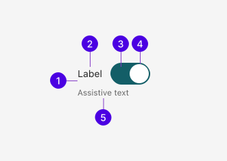
| # | Required | Element | Description |
|---|---|---|---|
| 1 | Container | Wraps the label, input, and assistive text. | |
| 2 | Label | Describes what feature or setting the Toggle controls. | |
| 3 | Track | Holds the thumb and indicates the current state through its background color. | |
| 4 | Thumb | Slides between the off and on positions within the track. | |
| 5 | Assistive text | Displays description or error text to aid the user. |
Guidelines
Toggle vs. Checkbox
Toggles and Checkboxes are both form controls that give the user the option to enable or disable a setting or feature. However, it's important to understand the difference between the two as they are not interchangeable:
- Toggles function similarly to real-world on/off switches. Form submission is not required; the setting takes effect immediately.
- Checkboxes allow users to select zero or more options independently to submit to a form. Deselection is allowed.
Best practices
Default state
Set Toggles to the default state that is safest or most common for the user. Avoid enabling destructive or data-sharing settings by default.
Appearance
Sizes
Toggles are available in three sizes: medium, small, and extra small. Use the size most appropriate to the given layout constraints.
Medium is the default size, used in the majority of contexts including settings pages and form layouts.
Small Toggles are used in tighter layouts such as table rows, inline controls, or condensed settings panels.
Extra small Toggles are used in the most space-constrained contexts.
Behaviors
States
The default unchecked and checked states. The unchecked track uses a neutral surface color, while the checked track uses the active accent color.
On mouse hover, the track background darkens to indicate interactivity.
On keyboard focus, the track receives the standard 2px focus ring.
Disabled Toggles cannot be interacted with. The track drops its accent color, but a disabled checked Toggle keeps a stronger fill than a disabled unchecked one so its state stays readable.
Truncation
Labels are truncated with an ellipsis by default when they overflow the available space. Truncation can be disabled to allow the label to wrap to multiple lines. Be mindful as truncated text may be harder to read.
By default, long labels are clipped with an ellipsis.
When truncation is disabled, the label wraps to multiple lines.
Content
Labels
When writing labels, it's best to phrase them in a way that makes it clear what will happen when the Toggle is turned on, not what is prevented when it's turned off. Labels should be self-explanatory without relying on surrounding context.
Assistive text
Description
Descriptions provide extra context when the label alone doesn't fully explain the Toggle's effect. Keep descriptions to a short phrase without end punctuation.
Error
Error messages communicate validation issues with the Toggle. Frame errors as an actionable step the user can take to resolve the issue.